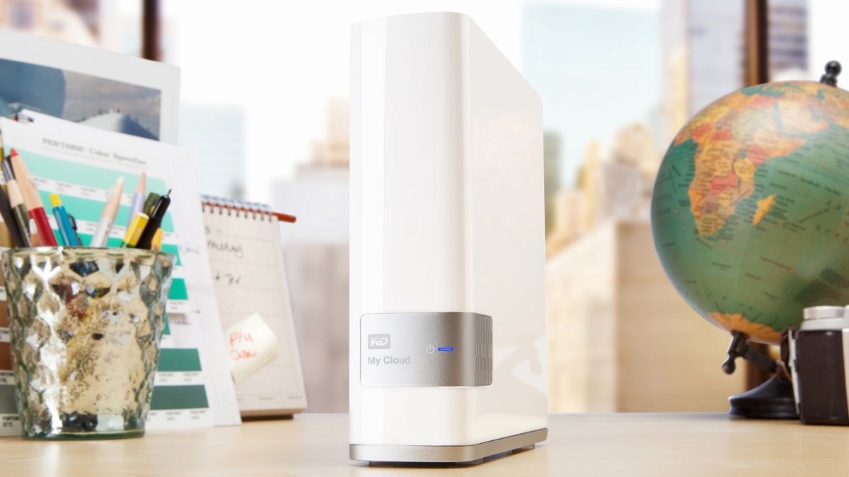
In 2014-2015, I was apart of the UX Design team at Western Digital exploring how to create personal cloud storage solutions with the My Cloud product line.
The Need
Western Digital had recently launched a new network-attached-storage platform called, My Cloud, and was doing UX research to increase their customer base. This effort was focused on busy moms, however, we knew that the device setup and onboarding flow was not intuitive and that it favored “tech-savvy” consumers. So we created a persona named “Margo”, a busy mother that loves to take photos and wants an easy, secure way to store them, and set out to create an experience she would understand and enjoy.
Constraints
- No access to a usability lab. So we conducted the sessions in one of the conference rooms at our office.
- The prototype was hand-built by me without any testing framework. Any changes we wanted to make needed to be implemented and tested before the next session.
- The UX Researcher also had to handle all of the communication and scheduling of the users which was very time consuming.
Approach
Project duration: 3 months
3 Team members:
- UX Researcher – tasked with creating test scripts and conducting the usability sessions.
- Visual Designer – provided design assets.
- UX Designer/Developer (me) – I was tasked with building an interactive prototype that simulated the onboarding experience.
When the users arrived, the UX Researcher would escort them to the conference room and follow these steps:
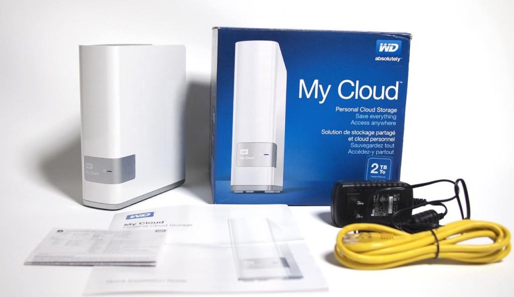
- Explain that they had just bought a My Cloud device because they were told it is an easy, secure way to save and manage their photos.
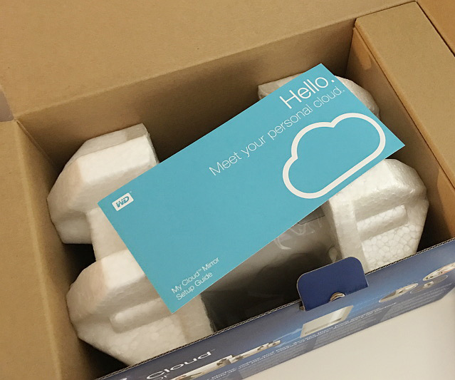
- Then hand them a My Cloud box and tell them to take the device out, pointing out the Quick setup guide, and attach it to the network.
- Once the external light turned solid blue (after 30-60 seconds), he would have them go to the computer in the room (with the simulated prototype) and follow the steps to create an account and initialize the drive.
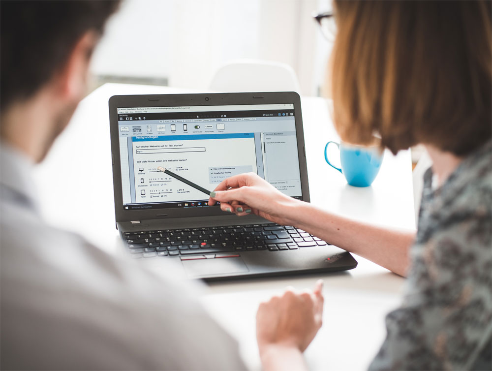
We had 10 sessions in all. I was able to observe them, take notes, and make subtle changes to the prototype as the testing progressed.
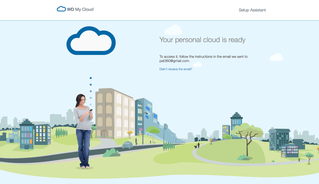
Note: This is a copy of the original onboarding prototype (for desktop testing). No data is stored. Use gibberish in any input fields in order to proceed to the next screen.
Results
I don’t have any hard stats from the research data from those usability tests but I do remember uncovering some major issues like confusion that the user needed to create a local account as well as a network account. It was a great experience for me to work directly with a UX Researcher and see first hand how to conduct an internal usability test.
Lessons learned
- Avoiding no-shows is half the battle
The UX Researcher had to handle the scheduling of the users and this was my first exposure to how challenging it can be to make sure they show up. Reminders and gifts help a lot. - It’s fine to fake it
You don’t have to create a fully functional prototype to get valuable feedback. And it’s okay to make changes as long as you test them and note how the user reacted to them. - Use the best tool
Instead of building a prototype from scratch, the budget may allow for building the prototype using a platform that allows for quick edits and A/B testing. Don’t be shy about asking but do some research to back it up.
