Be aware that a few visual examples contain language and topics that some may find disturbing and offensive. The dark web provides an anonymous environment that some people choose to use for nefarious purposes. These tools help build cases to deter, catch, and convict those engaged in illegal activity.
The Challenge
A small, agile team of engineers, analysts, and data scientists created a robust, text-only dark web search engine with a sizable amount of collected records that was growing daily but the UI and UX were subpar and did not have a cohesive design plan. Thinking they needed another frontend developer, I convinced the Head of Engineering during my interview to hire me as the Head of Design to overhaul the design and user experience of their tools.
The Plan
To succeed, we agreed to the following…
- Hire broad-skilled UX experts with research and visual design chops as an integral part of the product team
- Use Lean UX so Design is at least a sprint ahead of Dev
- Build a design system as the UX source of truth
- Utilize sketches and wireframing for quick design ideas
How it started
Within the first three months, we…
- Interviewed users, analysts, team members, and stakeholders to learn painpoints and start establishing goals
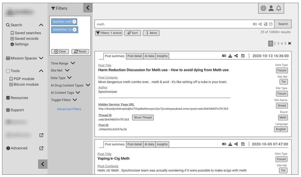
- Used sketches and wireframes (Balsamiq) to communicate quick design ideas
- Started using Figma for high-res designs and as a foundation for a design system
Three months after that, we…
- Hired a veteran designer with UX, visual, and interaction design skills to help formulate the plan and drive adoption
- Hired a product manager versed in CDH and started using FigJam for team collaboration
- Conducted a thorough heuristics evaluation of the products
- Started building a design system in Figma
Discoveries
From our research, observations, and user feedback, we found…
- Lack of consistent and cohesive design language, colors, icons, and patterns
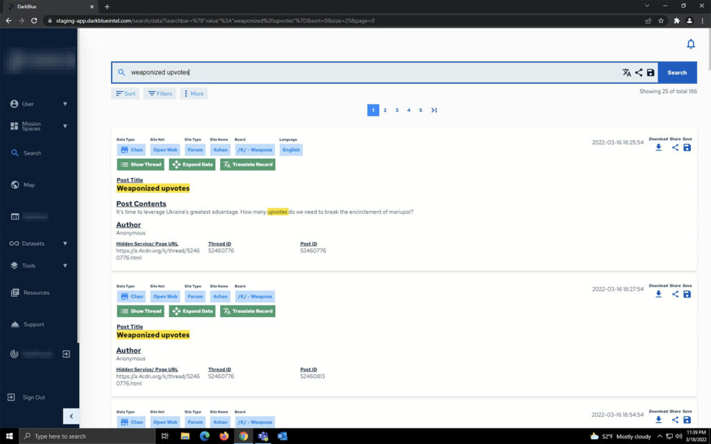
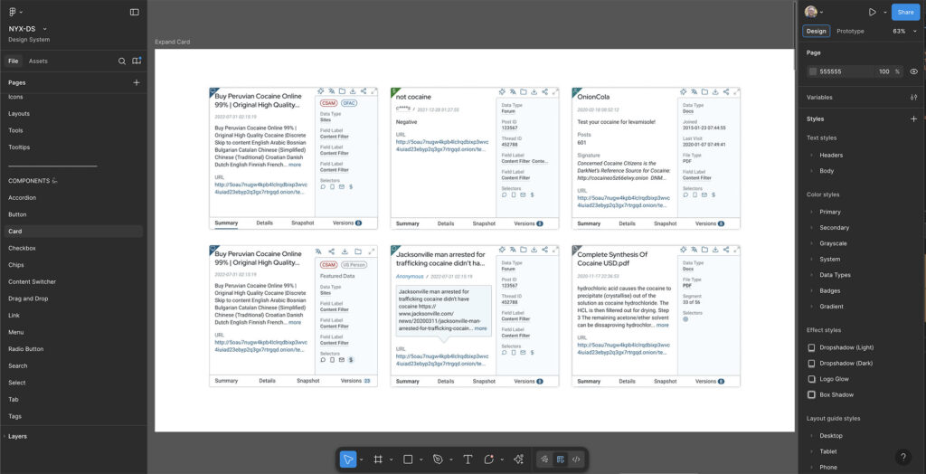
- Search results only displayed in one column no matter the screen width
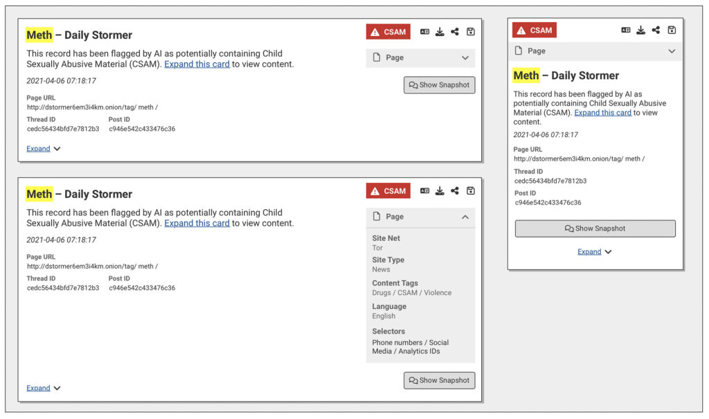
- Selectors (clues like unique email addresses) were buried and did not have an easy way to identify them
- Pagination greatly limited the amount of search results on a page
- Filters were hard to find in a slide out panel
So we made it a priority to address these issues and invested the necessary time to transform the user experience. This required…
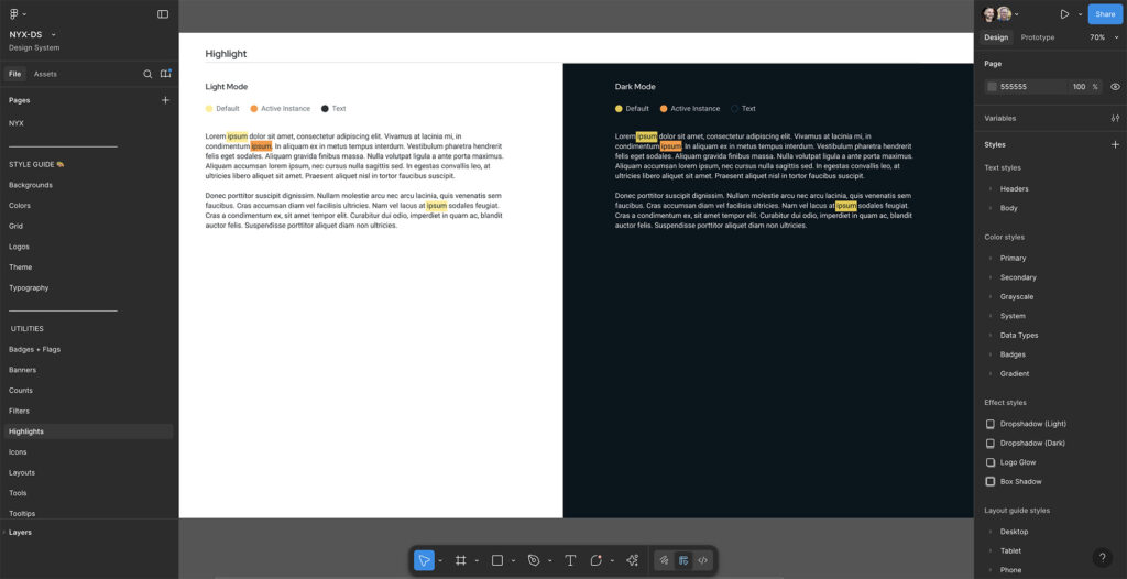
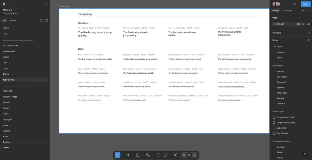
- Creating a sophisticated design system (style guidelines, color palette/variables, custom icon set, design language, fonts, etc)
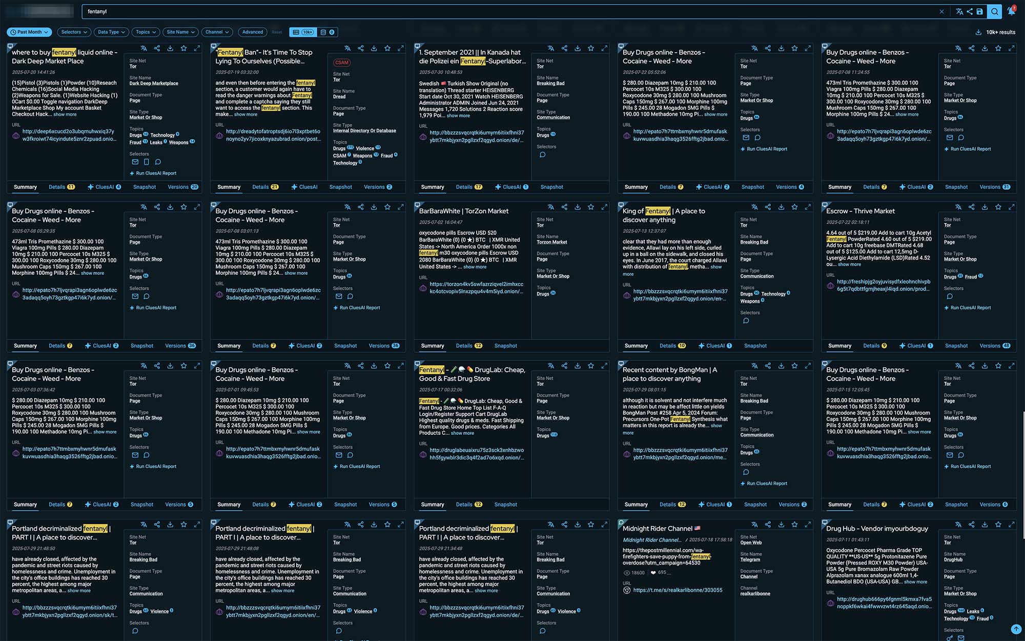
- Refactor search to use CSS Grid and media queries to allow unlimited rows and columns of cards
- Surface Selectors in featured area of cards and use icons to easily identify them
- Refactor search queries to utilize infinite scroll (no more pagination)
- Move filters to pill form directly under the main search field with less used filters in a easily discoverable slide out panel.
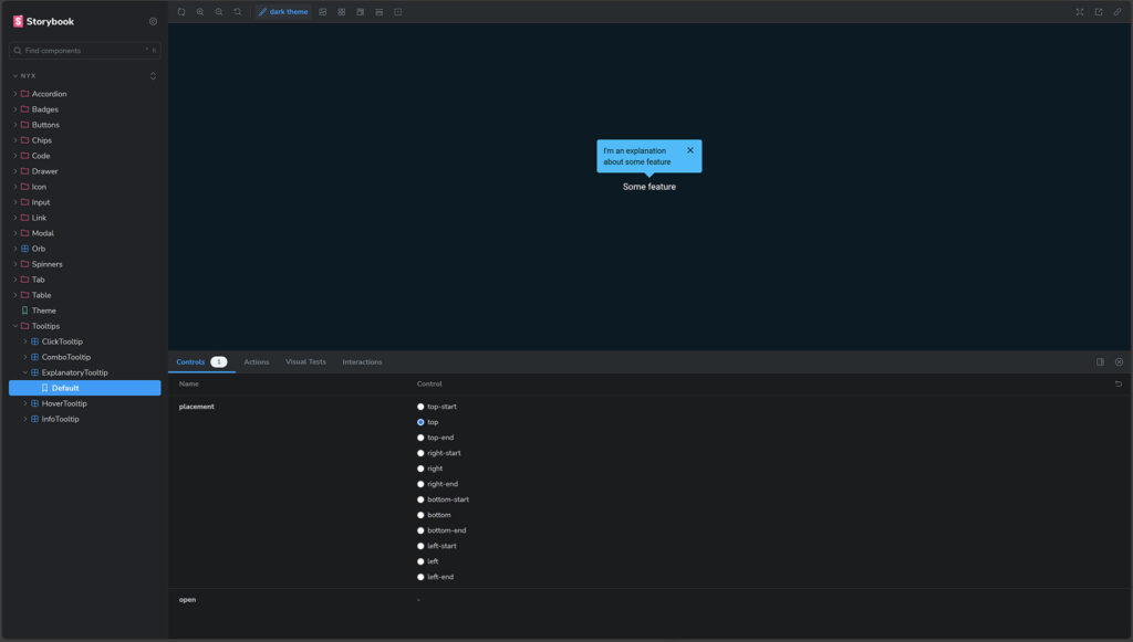
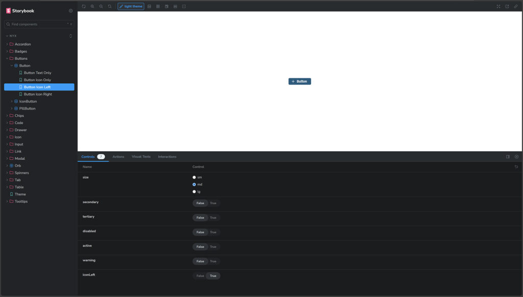
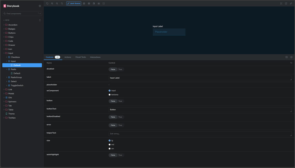
Storybook is a great design system solution for small product teams and we utilized it in GitHub to build and test components.
Lessons learned
- Always advocate for the user
Understanding the needs, wants, and painpoints of your users will uncover the parts of the puzzle that need focus and attention. - Work with what you have
Using a combination of Figma, FigJam, GitHub, Storybook, Confluence, and Balsamiq Wireframes gave us the tools we needed to create a sophisticated design system that will live and scale well into the future. - Encourage open communication
It’s critical to work closely with your users and team members to expose problems, discover solutions, and build excellent experiences.
Customer quotes
[This product] stands out above the rest. I haven’t come across a product like this yet. I’m achieving excellent and very beneficial results.
I love [this product]! What I’ve been able to do in a week as compared to what I use normally will make my job so much easier. I can’t wait to show this tool to the team and tell them this is what we should be using.
